
Getting customers to your website is expensive.
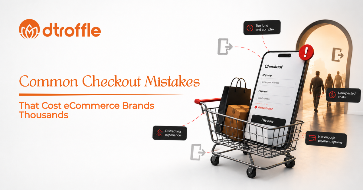
You may spend money on Meta Ads, Google Ads, SEO, influencers, and content to bring potential customers to your store. They browse your products, compare options, add something to their cart-and then disappear at checkout.
For many eCommerce brands, this is where revenue quietly gets lost.
The problem isn’t always the product, pricing, or advertising. Sometimes, the checkout experience itself creates unnecessary friction that makes customers rethink their purchase.
A complicated checkout form, unexpected shipping charges, limited payment options, forced account creation, or a slow checkout page can turn a ready-to-buy customer into an abandoned cart.
That’s why eCommerce Checkout Optimization is an important part of improving online sales.
Your checkout should make purchasing feel simple, transparent, secure, and effortless.
So, what are the common checkout mistakes costing eCommerce brands potential revenue?
Let’s break them down.
Why eCommerce Checkout Optimization Matters?
Customers don’t want unnecessary steps between deciding to purchase and completing their order.
Every additional field, confusing instruction, unexpected charge, or technical issue can create another reason to leave.
A well-optimized eCommerce Checkout Process should:
- Make purchasing simple
- Clearly display the total cost
- Offer convenient payment options
- Build customer trust
- Work smoothly on mobile
- Reduce unnecessary steps
- Provide clear delivery information
- The goal isn’t simply to create a shorter checkout.
It’s to create a checkout experience that removes friction while giving customers the information and confidence they need to complete their purchase.
15 Common Checkout Mistakes That Cost eCommerce Brands Thousands
1. Forcing Customers to Create an Account
One of the simplest ways to create friction is forcing customers to register before they can purchase.
A customer may be ready to pay but doesn’t want to spend additional time creating a password or filling out unnecessary information.
Better Approach
Offer:
- Guest checkout
- Optional account creation
- Social login where appropriate
- Simple account creation after purchase
Let customers complete their purchase first. You can encourage account creation afterward.
2. Making the Checkout Too Long
Nobody wants to complete a checkout form that feels like an application form.
Asking for unnecessary information can increase friction and create opportunities for customers to abandon the purchase.
Keep Only Essential Fields
Collect information that is genuinely required for:
- Delivery
- Payment
- Order processing
- Customer communication
A simpler checkout generally creates a smoother Online Checkout Experience.
3. Unexpected Shipping Costs
Imagine finding a product for ₹1,999 and reaching checkout only to discover an additional ₹300 shipping charge.
That unexpected cost can completely change the customer’s purchase decision.
Unexpected fees are a major contributor to Shopping Cart Abandonment.
Better Approach
Be transparent about:
- Shipping charges
- Taxes
- Handling fees
- Delivery charges
- Free shipping thresholds
Show important costs as early as reasonably possible.
4. Hiding the Final Order Total
Customers should never have to calculate what they’re actually paying.
The checkout page should clearly display:
Product Price + Shipping + Taxes/Fees − Discounts = Final Total
A transparent order summary helps customers feel more confident about completing their purchase.
5. Offering Limited Payment Options
Different customers prefer different payment methods.
If your checkout only supports one or two payment options, some customers may leave simply because their preferred method isn’t available.
Depending on your target market, consider offering options such as:
- Credit and debit cards
- UPI
- Net banking
- Digital wallets
- Cash on delivery where appropriate
- Buy Now, Pay Later where suitable
The right payment mix depends on your audience and business model.
6. Ignoring Mobile Checkout
A customer may discover your product on Instagram, click your ad, visit your website, and attempt to purchase directly from their phone.
If the checkout isn’t mobile-friendly, you could lose the sale.
Check Your Mobile Checkout
Make sure:
- Buttons are easy to tap
- Forms are easy to complete
- Text is readable
- Payment options work properly
- Pop-ups don’t block important information
- Pages load quickly
Mobile optimization should be a core part of Checkout Page Optimization.
7. Making Customers Navigate Away From Checkout
Every unnecessary distraction can interrupt the purchase journey.
If customers are sent to multiple pages, promotional banners, or unrelated sections during checkout, they may lose focus.
Your checkout should keep customers moving toward one goal:
Completing the purchase.
8. Not Showing Delivery Information Clearly
Customers want to know when they’ll receive their order.
If delivery information is unclear, they may hesitate before completing payment.
Clearly communicate:
- Estimated delivery date
- Shipping timeline
- Delivery locations
- Shipping method
- Tracking information
Clear expectations can make the purchase experience more trustworthy.
9. Missing Trust Signals
Customers are sharing personal and payment information with your business.
If your checkout doesn’t feel secure, they may hesitate to complete the transaction.
Include appropriate trust signals such as:
- Secure payment indicators
- Recognizable payment methods
- Clear return policies
- Customer support information
- Reviews or trust badges where relevant
Trust should be visible throughout your eCommerce Website Optimization strategy.
10. Complicated Coupon Code Fields
Discounts can encourage purchases, but coupon boxes can sometimes create the opposite effect.
If customers see a prominent “Have a coupon?” field, they may leave checkout to search for discount codes.
That can interrupt the purchase journey.
Better Approach
If coupons are important to your business, make the field available without making it unnecessarily prominent or distracting.
11. Poor Error Messages
Payment or form errors are frustrating.
Messages like:
“Something went wrong.”
don’t tell customers what they need to fix.
Instead, explain the problem clearly.
For example:
“Please enter a valid 10-digit phone number.”
Good error messages help customers correct problems without abandoning the checkout.
12. Slow Checkout Pages
Speed matters throughout the ecommerce journey-but especially at checkout.
A customer who has already decided to purchase shouldn’t have to wait for slow pages, payment screens, or unnecessary animations.
A fast eCommerce Checkout Process reduces friction and creates a smoother buying experience.
Regularly test:
- Page speed
- Payment loading
- Form submission
- Mobile performance
- Third-party integrations
13. Not Offering an Easy Way to Get Help
Customers may have questions during checkout.
What happens if they can’t find an answer?
If there is no visible support option, they may simply leave.
Consider providing easy access to:
- Live chat
- Customer support
- FAQs
- Contact information
Fast support can help remove last-minute purchase objections.
14. Poorly Designed Checkout Pages
Design isn’t just about making checkout look attractive.
It should make the process easy to understand.
Avoid:
- Confusing layouts
- Too many colours or elements
- Tiny text
- Hidden CTAs
- Excessive pop-ups
- Unnecessary animations
A clean checkout design helps customers focus on the information that matters.
For brands investing in eCommerce Website Development, checkout design should be treated as a conversion-focused component rather than simply another webpage.
15. Not Testing the Checkout Process
One of the biggest mistakes is assuming your checkout works perfectly because it works for you.
Real customers may experience:
- Payment failures
- Broken buttons
- Mobile layout issues
- Coupon errors
- Address problems
- Shipping calculation errors
- Regular testing is essential.
Test the entire journey from:
Product Page → Add to Cart → Cart → Checkout → Payment → Order Confirmation
This is a crucial part of eCommerce Conversion Rate Optimization.
How to Improve Your eCommerce Checkout Experience?
Fixing checkout problems doesn’t necessarily require completely rebuilding your website.
Start with the biggest sources of friction.
Step 1: Analyze Your Checkout Funnel
Identify where customers are dropping off.
Step 2: Simplify the Process
Remove unnecessary steps and fields.
Step 3: Improve Transparency
Clearly communicate pricing, shipping, taxes, and delivery.
Step 4: Optimize for Mobile
Test checkout across different devices and screen sizes.
Step 5: Improve Trust
Make payment security, policies, and customer support easy to find.
Step 6: Test Everything
Run regular checkout tests and monitor conversion data.
Small improvements can make a significant difference when thousands of customers move through your checkout every month.
How Dtroffle Can Help Improve Your eCommerce Website?
A high-converting checkout is part of a larger ecommerce experience.
At Dtroffle, we help D2C and ecommerce brands improve their online presence through ecommerce website design, Shopify website development, SEO, performance marketing, and conversion-focused strategies.
Instead of looking at checkout in isolation, we focus on the complete customer journey-from the first ad click to product discovery, checkout, and conversion.
The objective is simple: build an ecommerce experience that helps turn more of your existing traffic into customers.
Common Checkout Mistakes: Quick Checklist
Before launching or optimizing your checkout, ask:
- Is guest checkout available?
- Are there unnecessary form fields?
- Are shipping charges clearly displayed?
- Is the final price transparent?
- Are multiple payment methods available?
- Is checkout optimized for mobile?
- Are delivery timelines visible?
- Are trust signals present?
- Are error messages helpful?
- Is the checkout page fast?
- Can customers easily contact support?
- Have you tested the complete purchase journey?
If you answered “no” to several of these questions, your checkout may be creating unnecessary conversion friction.
FAQs About eCommerce Checkout
Q 1. What is eCommerce checkout optimization?
Ans: eCommerce Checkout Optimization is the process of improving the checkout experience to make it easier, faster, and more trustworthy for customers to complete their purchases.
Q 2. What causes shopping cart abandonment?
Ans: Common causes include unexpected costs, complicated checkout forms, forced account creation, limited payment options, slow pages, unclear delivery information, and lack of trust.
Q 3. How can I reduce cart abandonment?
Ans: Start by simplifying checkout, showing all costs clearly, offering preferred payment options, optimizing for mobile, improving trust signals, and regularly testing the checkout process.
Q 4. Why is mobile checkout important for ecommerce?
Ans: Many customers browse and purchase through smartphones. A poor mobile checkout experience can create friction and cause customers to abandon their purchases.
Q 5. How does checkout optimization improve ecommerce conversions?
Ans: A smoother checkout removes unnecessary barriers between the customer’s purchase decision and completed order. This can help reduce abandonment and improve the overall conversion rate.
Final Thoughts: eCommerce Checkout Mistakes
Your checkout page may be the final step in the customer journey-but it can have a huge impact on your revenue.
You can have great products, compelling ads, strong social proof, and thousands of website visitors. But if customers encounter unnecessary friction when they’re ready to pay, those opportunities can disappear.
That’s why Checkout Optimization should be an ongoing part of your ecommerce growth strategy.
Start by identifying where customers are dropping off. Simplify the process, improve transparency, optimize for mobile, strengthen trust, and continuously test the experience.
Because sometimes, increasing ecommerce revenue isn’t about getting more visitors.
It’s about helping more of the visitors you already have complete their purchase.