
A customer discovers your product on Instagram, clicks the link, and lands on your website. The product looks promising, but the page takes too long to load. The images are difficult to navigate, the text is too small, and checkout requires filling out multiple fields. Within seconds, the customer leaves.
For many direct-to-consumer (D2C) brands, this is where potential sales are lost.
Mobile shopping has become an important part of online retail, yet website experiences do not always meet mobile users’ expectations. Baymard Institute’s 2026 benchmark found that 75% of the mobile eCommerce sites it evaluated had mediocre user experience.
This is why mobile-first design for D2C brands is more than a design preference. It is an important part of creating a website that helps customers move from discovery to purchase.
Why Mobile Visitors Leave Without Buying
Mobile users interact with websites differently from desktop users. They browse on smaller screens, use touch controls, and may shop while multitasking.
Common problems include:
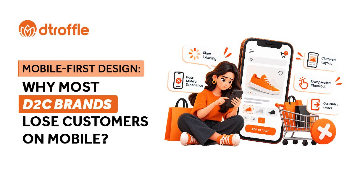
- Slow-loading pages: Heavy images, unnecessary scripts, and poorly optimized elements can delay the shopping experience.
- Difficult navigation: Complicated menus make it harder for customers to find products.
- Crowded product pages: Small text, unclear product details, and difficult-to-use image galleries create friction.
- Complicated checkout: Too many form fields and unexpected costs can discourage customers from completing their purchases.
Individually, these issues might seem minor. Together, they can make purchasing feel like too much effort.
What Mobile-First Design Actually Means
Mobile-first design means designing the website for smaller screens first and then adapting the experience for larger screens. Instead of squeezing a desktop website onto a phone, brands prioritize the information and actions mobile shoppers need most.
For a D2C brand, this means making product discovery simple, presenting essential information clearly, and keeping the path to purchase straightforward.The goal is not simply to make the website fit the screen. It is to make shopping easier.
Five Ways D2C Brands Can Improve Their Mobile Experience
- Make speed a priority- Optimize images, reduce unnecessary scripts, and test important pages on mobile devices. Google’s Core Web Vitals can help identify loading, responsiveness, and visual stability issues.
- Simplify navigation- Keep category menus easy to understand and make search accessible. Customers should be able to find relevant products without navigating through multiple unnecessary steps.
- Improve product pages- Use clear product images, readable descriptions, visible pricing, and easily accessible size, colour, or variant options. Display important information, such as delivery details and return policies, where customers can find it.
- Make checkout easier- Reduce unnecessary form fields, enable appropriate autofill, display delivery charges early, and offer convenient payment methods. Keep error messages clear so customers can correct mistakes without restarting the process.
- Design for comfortable interaction- Use readable typography, sufficiently large touch targets, clear buttons, and enough spacing between interactive elements. Customers should not have to zoom in or repeatedly tap an element to complete an action.
How to Know Whether Your Mobile Website Needs Improvement
Start by reviewing your website analytics. Compare mobile and desktop conversion rates, examine where users leave the purchase journey, and identify product pages with high traffic but low add-to-cart activity.
Use Google PageSpeed Insights to assess performance and Core Web Vitals. Test the complete shopping journey on different screen sizes, from opening a product page to completing checkout.
Prioritize problems that create the most friction rather than redesigning everything at once. After making changes, measure their impact on actual user behaviour and conversions.
Conclusion: Mobile-First Design for D2C Brands
A D2C website can attract visitors through advertising, social media, and search, but a frustrating mobile experience can prevent that attention from turning into sales.
Mobile-first design helps brands remove unnecessary friction, make products easier to explore, and simplify the purchase journey.
The goal is not just to build a website that looks good on mobile. It is to build one that makes buying feel effortless.